Welcome! This forum has a treasure trove of great info – Scouters helping Scouters! Just a heads up, though - all content, information, and opinions shared on this forum are those of the author, not the BSA.
I included screen shots. If you pull up the two links I sent, it’s pretty obvious, the difference.
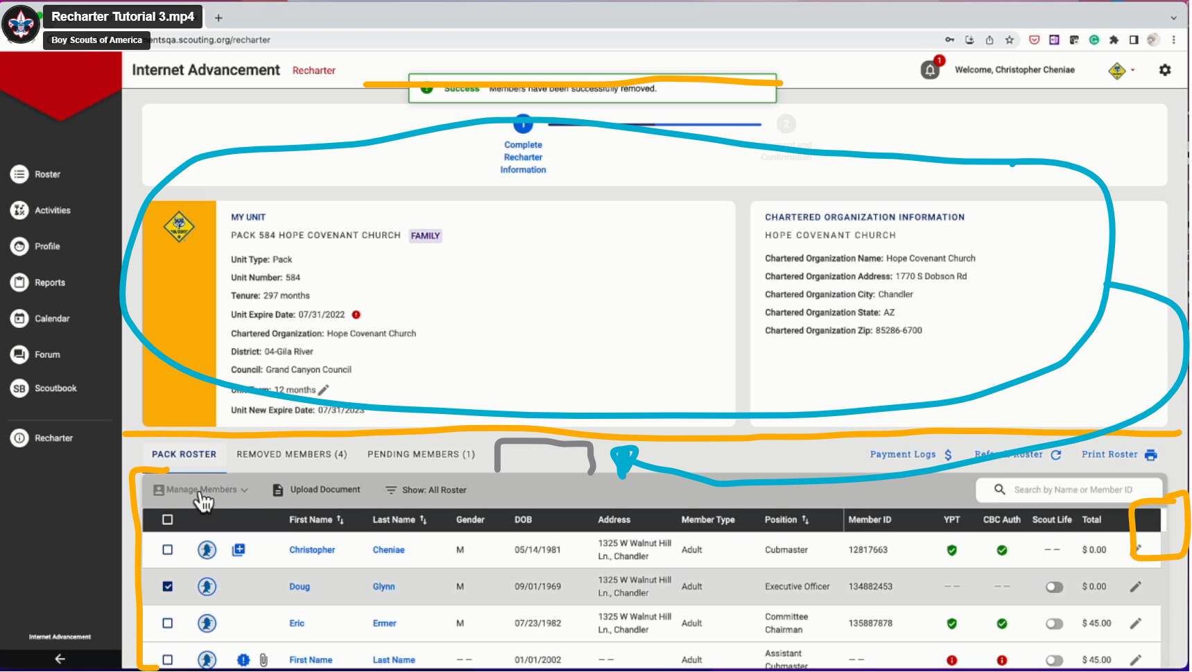
I have a second scrolling window that is bested in the page. So rolling in a mouse only scrolls the big window and not tha area with the actual names in it. Even though I have 100 records set to view, that small window only actually displays six at a time. My roster view shows 19 or more records and allows for a single scrolling action with the mouse.
Trying to look through names visually is like viewing a ship through the bottle hole.
when my cursor is over the names I easily scroll up and down in recharter - the nested is nice cause the functions for individual names stay there. The different UX for the 2 different screens is not ideal
2/3 of the screen is static data that I check once and never deal with again. I should be able to scroll down and have 90%+ screen view of just the roster, the stuff I actually have to work with and search through. Instead I’m dealing with that small viewing area of the roster while I scroll up and down viewing it through a 30% tall window. If you just got rid of that scroller and made the whole page fixed, I’d be able to scroll down past the static unit information to view more of the roster.
Another option would be just to move all of the static unit information to a “Unit Info” tab that is first or last and move all of the tabs to the top. That way you have the full rest of the screen, regardless of the tab you’re on. The scrolling is problematic.
While we’re making a wish list, it would be helpful if we could toggle whether or not the unit has received their payments. Maybe because I’m looking at it with new eyes, but that seems like the hardest thing to track. Maybe just adding a status (Current, Renewed, Removed). Something to help narrow down who hasn’t yet paid.
I have a tiny window with its own scroller for the Recharter screen. At first I couldn’t tell why it was only loading a few adults. Then I realized that there was a second scrolling window nested in the page.