Closed
Open
Feedback for the Scoutbook plus team
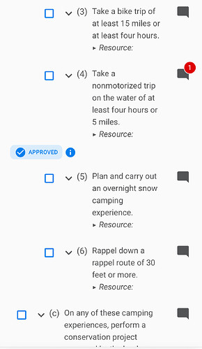
The interface for merit badges on mobile is very difficult to understand. (See screenshots) Number 4 is completed and approved. But the box next to number 4 is unchanged, the approved is at the bottom of the paragraph, indented strangely, and so close to number 5 - leaving what the “approved” actually goes with very vague. Additionally, the user needs to know to hit that up/down carrot and the “approved” box to open details (as shown in the second screen shot) - I found it through trial and error. It’s very difficult to go through a merit badge and figure out what is done and what needs doing with this interface.


